Monday, May 31, 2010

Interview with presenter Jason Das

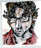
Atmospheric skies, delicate line work and bold black strokes, that's what first drew my attention to Jason Das' work.

As we visit his website, we discover all his different activities, as he puts it himself: blogs at Gas Water Nothing, contributes sketches to and serves on Urban Sketchers, shapes sounds in The Glass Bees, and saves the world with SuperVegan.

Jason works as an illustrator and also designs, builds and renovates websites. It was in 1995 that he created his first kind of website and he started sketch-blogging in 2005. For someone like me, who has just been discovering the net in the last couple of years, Jason is an artist I'm looking forward to meeting and learning from at the Symposium.

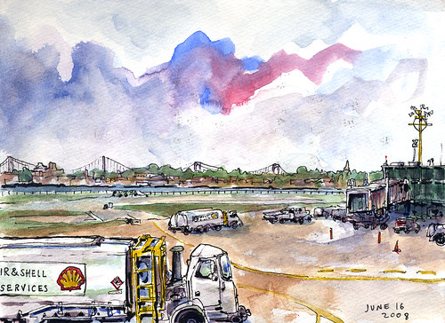
La Guardia Tarmac
La Guardia Tarmac

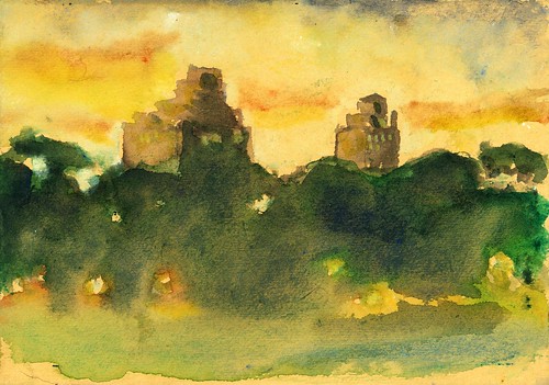
Prospect Park Sunset
Prospect Park sunset

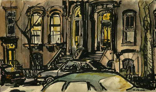
From Smooch
view from Smooch

Around the Clock

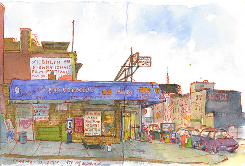
4th Avenue & Union

Multidisciplinary artist, illustrator and web developer. The web is the place you use to communicate not only about your work but also about things you care. You're interested in online communities and productive social networking. How do all those activities feed each other?

I worry they mostly undercut each other by using up my time and energy! Ideally, I'd like to find sucessful ways to synthesize and reach across any barriers between these different activities.

It can be tough balancing the people I cross paths with and work with. Animal rights activists or illustrators may not have an easy time understanding conceptual art. Postmodern fine arts people are often dismissive of illustrative art, and extremely insensitive to animal and environmental issues. Illustrators often forget to exert a point of view or sense of morality via their work.

There are great traditions of political art and illustrated storytelling, but I haven't (yet) found away to do that sort of work on a level that's satisfactory to me. Part of my problem is I'm not big on polemics and sloganeering--I'm the last guy you'll see wearing a "Go Vegan" T-shirt.

I do think that Urban Sketching can be a political, activist activity. There's great value in sharing honest reckonings of our everyday world. But obviously this is more true if you're documenting an immigration protest than some old interesting building mouldings.

The art and performance I do with the Glass Bees is containing more of my location-sketches, and our projects are increasingly dealing with sense of place and environmental issues, such as last year's "Venice Brooklyn" and our upcoming "Reading Governors Island" which will be part of the Figment Festival.

Meanwhile, as you well know, as great as it is to be involved in worldwide causes (like Urban Sketchers), we can't let that replace being active members of our local communities!

You choose to publish sketches that are quite different in style, technique and approach. Do you kind of plan it or it all depends of the time and tools you're carrying?

I very rarely plan it. I try to have a diverse set of materials with me, but even then I may misplace something, a favorite pen will run dry, or pan of color will run out and I won't get around to refilling it. The sketchbook I use most often these days has different textures and colors of paper in it, so that makes for some surprises, too.

I used to worry about not being a proper artist because I didn't have a "style." At the same time, I find far too many artists (and not just visual artists!) are trapped by their style. Of course, the more work I do, however varied it may be, some elements of style do become recognizable. I won't be surprised if my artwork is a lot more consistent a few decades from now.

In some of your sketches you will use big black strokes made by a brush pen or by a marker. As a sketcher I find it really difficult to make such strong lines work and I admire how you're able to use them so well. How did they come up in your work?

I can be pretty impatient. The more ink I can put down at once, the faster the sketch is finished. Also, if I'm sketching an unposed animate subject (passengers on the subway, kids in the park, animals), working fast is a must!

Another good use of big black strokes is this: I'll use a brown or sanguine line for finer linework and a black brushpen for shadows or other dark areas. This way I'm not stuck with the countours being the boldest element.

The lecture you will be giving at PNCA is titled 'From sketchbook to screen'. Tell us about your vision of the net and how it can help sketchers and artists. Sometimes it can be very time consuming to share our work online and that take us away from spending more time drawing. What are the benefits of sketch-blogging?

As time consuming as it is, it's a lot easier than it would have been before we had the Web. I suppose we'd be organizing touring shows of our sketches, and mailing them around the world, or publishing paper magazines. A relatively tiny amount of work would be seen by a relatively tiny amount of people, and it would all be frightfully expensive.

If you are only sketching for your inner self, there's no need to share. But as soon as you want more people to see your work, the internet is the way to go. I love the feedback I get from fans and fellow sketchers all over the world, and I love discovering other people's work.


The Internet has made sharing information possible in a way that is unprecedented in human history. I find this tremendously exciting. The barriers to entry, at least for most people in the First World, are extraordinarily low. Anyone can publish their own content, and see everyone else's. Coping with all this content is a challenge of course, but what a great problem to have! As I'm more experienced with computers and the Internet than many of my fellow sketchers, I'm eager to help them make the most of the tools available, and understand fundamental concepts so they don't get left behind by rapidly evolving technology.

• Jason's weblog.
• Jason's work in flickr.

Friday, May 28, 2010

Canson to donate sketch and art pads

Hi sketchers. How're the preparations for Portland going? All signed-up and ready to go?

If that's the case, you may be starting to think about what sketching gear to bring. On Thursday, Symposium presenter Isabel Fiadeiro posted the first of a series of posts presenters will be doing about their own sketching tools. We hope those we'll give you some ideas.

But no matter what you decide to pack, we are thrilled to let you know that some sketching material will be waiting for you at PNCA.

Canson, the renowned paper company that has been producing the world's finest art papers from mills in France since 1557, will provide a set of sketch and artists pads to each participant, as well as a special edition sketchbook with a variety of papers.

The items Symposium participants will receive come from Canson’s new line of redesigned Art Pads. The art pads are for artists at all levels ranging from students to professionals. The line includes Artist Series, Foundation Series and XL® series which feature artist quality papers with innovative pad features.

We are really excited about this collaboration with Canson and hope it will continue to develop in the future as Urban Sketchers work to promote the art of on-location drawing and to connect with each other.
Follow Canson on Facebook at www.facebook.com/canson and on Twitter @cansonpaper.
Thursday, May 27, 2010

sketching gear

 These are the three sketchbooks I'll be travelling with on my trip to Portland. They're all small. The one on the left which I have covered with some wax print bought in the local market is 12cm X 16cm and its of kraft paper made by Paperchase. The one on the right is cloth bound and I used acrylics to dab it with the predominant colors of Mauritania it is 14cm x 14cm of a creamy white paper is trav.e.logue, hand.book by Global Art Materials. The one on the forefront was a present from a friend its pages are in sooth kraft paper and the cover is of hand made paper its 10cm X 14.5cm  and very special I'll use it very occasionally, twice in 2007 and a couple of times this year on a trip inland. No idea where it comes from.
 
And these are my tools, some have been with me for years, like the red Chinese brush and the metal tips things used for calligraphy. Others like the water-brushes I only discovered last year. My pen (which I always carry extras) is the  pilot G-TEC-C4 with a 0.4 nib or the 0.25 nib, the last one does get stuck very easily with the fine particles of dust that cover my paper here in Mauritania.
 The watercolor box, old as well.  I recharge it on my trips to Europe or get friends to bring the small pans I'm running out off. The tiny brush is a 00 da Vinci made of Kolinsky Marder, that's what I'll use if I'm sketching directly in watercolor specially if its a portrait.
And last my tiny water bottles. A pure Mauritanian product done by the Moorish women using old pill bottles. I only seem to find them inland in remote oasis. Women used them to keep their home made incense.

Wednesday, May 26, 2010

Field sketching sessions Q & A

Whether you have already registered for the Symposium or not, you may have questions about the process to sign-up for the field sketching sessions offered during the three-day conference. Here is an outline of the process.

How do I sign up for the field sketching sessions?

Within 48 business hours of your registration, you should receive a form via email from PNCA to select your preferred sessions. Consult the schedule to find out the instructors who are leading each session and to see availability. If you have already registered, you should have received the email by now or will be receiving it shortly — email forms are sent out in the order in which people registered.

Will I be able to change my choices?

Once we're all in Portland, face-to-face communication will make it easier to trade spots should you change your mind about a session. We'll make every effort to facilitate that.

What if a sketching session I want is full?

We'll look into ways to adjust the schedule and meet participant demand as the sign-up process continues. Some presenters may lead more than four sketching groups if demand warrants it.

You should also keep in mind that there will be more opportunities to interact with the presenters during the morning convocation hour and lecture times twice a day, not to mention the time before and after the daily program, when presenters will likely stick around to spend extra time with participants.

Monday, May 24, 2010

Interview with presenter Veronica Lawlor

Veronica Lawlor aka Ronnie, as she is affectionately called, never fails to amaze everyone with her fluid and dancing quality line work with urban landscape, figurative and festive themes. Recently, her May 11 post on Urban Sketchers which she drew New York City from a tall building in Wall Street stunned us with such genius loci, great sense of place and abstract line quality. A true New Yorker, Ronnie's interpretation of the big apple is incredibly filled with rich emotions. She always knows which parts to omit or reduce and what lines to use in all her drawings. I am also impressed with her choice of colours in some of her sketches.

I first knew Ronnie through her work on Urban Sketchers and I am excited to meet her in person during the first Internatioanl Urban Sketching Symposium at Portland this July. Coming from similar background with years of teaching under our belt, I have the following questions for her:


Understand you are one of the founders for Dalvero Academy and you also teach at Pratt Institute and Parsons School of Design. What is your view on the relationship between art and design and how they should compliment each other?

To me, art and design are synonymous. You can’t have a good design without art and I can’t imagine a piece of art without design. As a teacher I love drawing because it reveals the truth of the artist’s own sense of design. Drawing reveals where a student’s strengths lie: fashion, architecture, sculpture, painting, film, illustration, photography, you name it. And then drawing helps them to get there. It’s the tool of the artist and also like a crystal ball to their future.

When I search for “reportage drawings”, your name appears everywhere on the results. What is reportage drawing and why do you think reportage drawing as an art genre is important?

The word reportage comes from the French, meaning ‘the act or process of reporting’. Reportage drawing can be journalistic or descriptive of place and can carry the artist’s opinion. Since it is painted or drawn and not photographed, reportage illustration can take liberties with ‘reality’ in order to be clearer in meaning. It is important to the art genre because it is a direct artistic response to a place or situation, right there on the spot, and it becomes very instinctive. In that it is different from the majority of artistic experience that involves the artist alone in a studio working.

Since there is a direct connection between the artist’s hand, eye and mind, it can be very emotional as well. Reportage is so rewarding for me because I love it as a way to interact with the world and contribute.

You are the author for several books and your works are exhibited in galleries and museums. Can you tell us more and what these achievements mean to you in your role as artist, illustrator and educator?

The gratifying thing about having my work published and in gallery or museum settings is that I am able to reach the public with it. To me, art is always about communication with people. When my drawings of September 11th were exhibited at the Fire Museum in New York City, I had firemen coming up to me with tears in their eyes telling me how emotionally affected they were by seeing them. That kind of emotional connection is such a big part of the reason why I started drawing in the first place. I can be a bit shy at times, but I’m really an extrovert at heart, and drawing allows me to reach out to people who I might otherwise never come in contact with.

You are the only artist to draw, on the spot, the 9/11 attacks on the World Trade Center, share with us the emotion and how did you manage to go through the wreckage to do the reportage. Was it tough and how did you recover from it?

The attacks on the World Trade Center were such an unbelievable source of grief for New Yorkers. Many of us (myself included) lost friends or family that day; all of us lost the World Trade Center. I have lived my entire life in New York City; those buildings are alive to me. Every day when I look up and see the Empire State Building and I feel like I’m home. The World Trade Center was the same.

I was in shock when I was making those drawings, but it felt like the right thing to do. Documenting what was going on was a way to work through my emotions, both during and after the attack. Over the next few months I drew and drew everything that was going on. It gave me a purpose and made me feel as if there was something I could contribute in a situation where the reality was that I was powerless over it.


more drawings by Veronica on 911 here

As one of the Board Directors for Urban Sketchers, what do you wish to see at the upcoming Symposium in Portland?

I hope that the symposium will promote the art of drawing on location and bring its practitioners from all over the world together. There’s nothing better than being with a group of people that have the same love that you do. And I hope this symposium will be the beginning of many more!

• Veronica's blog.
• Veronica's website.
• Veronica's drawings.

Thursday, May 20, 2010

Matthew and Simonetta, architects in sketchbooks -2

Matthew and I had a sort of conversation on our approach to urban sketches, instead of a simple interview. This is the second part of it.

Largo Baracche
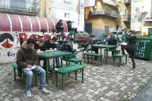
Simo Capecchi's students drawing in the center of Naples.

Matthew: When you are trying to teach sketching (or how to use a sketchbook), what are the most common difficulties you encounter with your students, and how do you overcome these challenges?

Simonetta: With architecture students to whom I lectured in November this year, I had great difficulties in convincing them that drawing freehand is going to be useful even if they will design with the computer. They are intimidated by the artistic aspects of drawing and seldom use colors (their sketchbooks here). I can understand this, since I have drawn with ink pen and rulers for 15 years as well. I have been a student in the ’80s before CAD, and even in that period the value of freehand sketches was not so appreciated in Italian Architecture faculties. It’s a common idea that the only way to draw is to have a "natural" talent for it, so the main difficulty is to convince students not to give up and dedicate time to drawing: they often feel exhausted after only 30 minutes! Usually I show my own process, bringing them my old notebooks as a student with all my bad pages to demonstrate that anyone can improve their skills with practice.

Largo Pignasecca

Simo Capecchi, view from the faculty windows, drawing with students, nov. 2009.
Ink pen on Moleskine large.


Matthew: Interesting – I have almost the exact same experience! I believe that both digital graphics and hand drawing are essential skills for designers, but it does take a greater commitment and more patience to really develop hand drawing skills. I have found that if students do learn to draw freehand, they value the skill so much more than being able to draw with digital tools. They have a greater sense of achievement, and I think this carries over into many other areas. But the biggest problem I have is that students tend to resist drawing frequently, and they don’t always see the value of studying other people’s drawings. But nevertheless it is so rewarding working with students and seeing their successes.


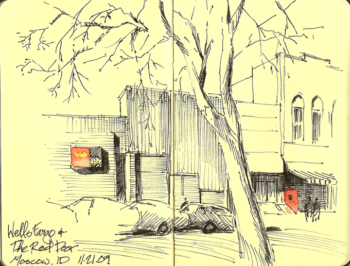
Matthew Brehm, nov 2009, sketchcrawl in Moscow ID. Ink pen on Moleskine pocket.

Matthew: How do you keep up with all of the wonderful online sources for sketching examples – blogs, flickr, etc.?

Simonetta: I started a blog in 2006 being unaware of the revolution it had begun, in terms of time I would devote to it and also of possibilities to comunicate with people all over the world. I'm still suffering the consequences of it, Urban Sketchers being the most “dangerous” and involving one. Now I mostly use a blog and flickr (plus closed projects + + + + +), and it’s already a big effort for me to keep them updated. Years ago I was among the first ones to use Issuu, after I saw Lapin use it. It has such a good resolution but it takes time to prepare, so till now I uploaded just a few sketchbooks on Issuu.
I'm also preparing a video channel to document a group of 50 Moleskine of various authors I collected in my exhibitions on travel sketchbooks in Naples. They are already on flickr and edited in a book, but a video is the best way to get the feeling of the intere sketchbook, now that the quality is much better than before. I don't like facebook and twitter, those are really too much for me. I’m already spending almost the same time on the Internet than drawing while I'd like to dedicate more time to real life.


Matthew Brehm, drawing with students in Portland, 24th Sketchcrawl sept 2009.
Moleskine watercolor Large.


Matthew: I’m always in awe of artists who are able to be so prolific in their sketching and especially when they manage to share so much of their work online. You’re right that Urban Sketchers is “involving” – but I never feel as if I have wasted my time when I see all the wonderful drawings and stories. I do feel overwhelmed sometimes, and, as you mention, occasionally I fear that I’m spending too much time looking at other sketches instead of sketching myself. But still, the communication that the internet has allowed is absolutely amazing – the connections that have been made and that will continue at events like the Portland Symposium, this is unprecedented. Sketching on location has had a social aspect to it for a very long time, but the number of new connections being made around the world is a relatively new phenomenon. It’s exciting to be part of this, even if it requires a time commitment to keep up with the new work that appears every day. (Matt's blog and Flickr)


Matthew Brehm's students in Rome, summer 2009.

Simonetta: From the Internet and our community of sketchers I get new ideas every day, but I also fear the possibility of being confused and loose my personal voice. I hope in the long run we are not going to draw in the same way, from Naples to Moscow, from Singapore to Sidney! I can’t wait to meet you and all the Portland participants and I’ll be very happy to find, besides all we have in common, deep differences among us...

Monday, May 17, 2010

Matthew and Simonetta, architects in sketchbooks -1

Mattthew and I had a sort of conversation on our approach to urban sketches, instead of a simple interview. This is the first part of it.

Matthew
: How often do you sketch, and how much time do you typically spend on a single sketch?

Simonetta: Sometimes I do not open my sketchbooks for days, sometimes I draw the entire day. I can spend a minimum of 15 minutes on a sketch, and 30 minutes to 1 hour on a watercolor. Lately I'm trying watercolor on loose pieces of paper (50x25 cm) and it takes me longer. I could draw for hours if I'm not interrupted, I'm never tired of it, I really like the feeling of being completely concentrated on it.

Matthew: I can also go for days without drawing, because I’m so often busy with work and the rest of my life. But I am almost always thinking about drawing, so when I get the chance I really enjoy it. Because I teach architecture, sketching is part of my focus with when I’m working with students, but sometimes I feel like I don’t sketch for myself quite enough! When I am using a sketchbook, I usually just spend 15-20 minutes on a drawing. When I use loose paper (23x31cm, or 9”x12”) I try to spend about 30-45 minutes on a drawing, usually longer if I’m using watercolor or a mix of ink and watercolor. I’m usually happier with the results if I keep the sketch relatively brief, but some subjects require more time and patience.


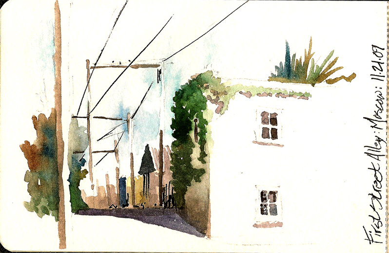
Matthew Brehm, Watercolor on Moleskine sketchbook pocket size (14x9 cm), Moscow ID.

Simonetta: When my childs where younger, I used too very small sketchbooks like this on Ustica island (14x9 cm), that I do not prefer anymore. Since I have more time and maybe because my eyes are not as good as before, I'm enjoing the experience of bigger pieces of paper even if is not that practical to carry on travels. I bought new brushes n.20, I use more water... and it does takes more than half an hour.

palazzo Donn'Anna

Simo Capecchi. Palazzo Donn'Anna Napoli. Watercolor on Arches paper (56x23 cm), 1 hour approx.

Matthew: What are your preferred sketching subjects?

Simonetta: I guess I feel more comfortable when I draw buildings, since I studied as an architect. I love the best to draw cities and landscapes and people from a panoramic view. I always try to go on top of terraces, towers, hills... this goes with my passion for climbing, both mountains and trees.

Matthew: I am also more comfortable with buildings and urban spaces, which is no surprise since I also studied and now teach architecture. My preference is to be in the space I’m trying to draw, with something dramatic about the perspective and the light – I almost can’t draw on grey, rainy days because I need to see light contrast to become interested in a particular view. I have been participating in a weekly figure-drawing session, trying to break my aversion to drawing people, and this has been a great experience. It’s very different than sketching in an urban environment, but I think it’s good to vary the subject matter and the media on a regular basis.


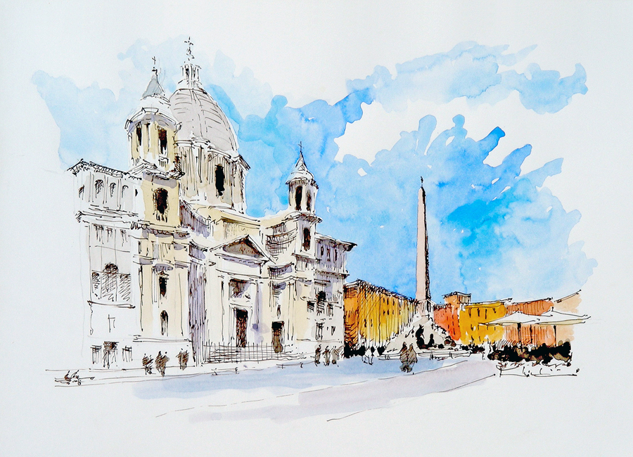
Matthew Brehm, drawing with students in Rome, Piazza Navona. Watercolor and ink.

Simonetta: I agree. I had a weekly figure-drawing session too, with Spanish painter Pedro Cano that has been a very intense, almost shocking experience: 30 minutes sessions on 50x35 cm. paper with no pencil admitted. Some (strange) drawings of mine here. I like to draw figures from ancient statues, for instance at the Archeological Museum, much more easy.

Afrodite
Simo Capecchi, Archeological Museum in Neaples. Watercolors on Arches paper 20x30. 20 minutes.

Matthew: Do you make plans in advance to sketch particular subjects, or are you more spontaneous?

Simonetta: I have dedicated sketchbooks like: Naples ink, Naples watercolors, Appennins, Bologna... for places or cities where I often go, I start a new book for each trip or long vacation and I have a small sketchbook for daily life, conferences and unplanned drawings. I also made sketchbooks as a project, like these ones for an exhibition, on a square in Bologna and about two days in Paris.

Matthew: I have some dedicated sketchbooks as well: University of Oregon campus, University of Idaho campus, and I collect my loose sheet sketches into portfolios for a particular time – such as each summer I have spent in Rome. I am trying to simplify, and use only one sketchbook for notes, journal entries, and impromptu sketches, but it’s not easy because I enjoy the properties of different books and papers. Most often, I don’t make plans to draw something specific, but occasionally I will see a certain kind of sunlight on a building and make a mental note to return at that time another day. This happens in Rome very often, because I am usually busy with students and need to come back to sketch when I have free time.

Simonetta: I know you are leaving for Rome again, good luck with your students and see you soon, in Naples and then in Portland!

Second part of this post will follow in a few days...

Friday, May 14, 2010

Symposium schedule

Things are starting to get even more exciting. Here's how the schedule is shaping up! Click on tabs below to see the schedule for each day and use the scroll bar to the right to navigate each sheet.


>>May 18 update: Registered participants are now being contacted to sign up for field sketching sessions in the order in which they registered. We hope to be caught up with all the people who have already registered within the next couple of weeks.

Wednesday, May 12, 2010

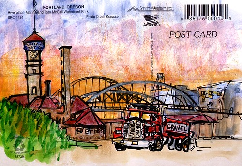
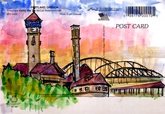
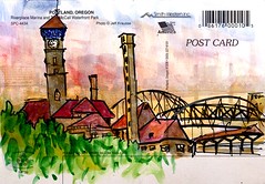
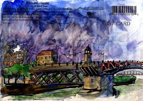
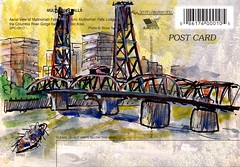
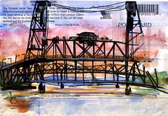
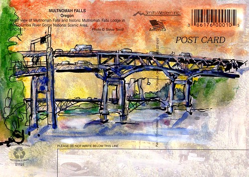
Postcards from Portland

I once regarded sending postcards to friends and family while traveling a thankless chore. Then I started Urban Sketching! It may still be a chore, but it's far from thankless.

The main lesson I've learned since doing these two years ago is that it's better to use proper watercolor paper in postcard-form than attempt sketches on the slick, already-printed-on backs of commercial postcards.

pdx postcards 9 pdx postcards 3

There's no need to think up words, and even if you sketch the same thing for multiple people, each version will be unique.

pdx postcards 7

pdx postcards 5 pdx postcards 2

I promised you bridges, didn't I?

pdx postcards 1

pdx postcards 4 pdx postcards 8

pdx postcards 6

(I did quite a few more than these, but didn't have a chance to scan them all before they were mailed.)

Monday, May 10, 2010

Portland: Bike City


For sketchers who are also bike enthusiasts, Portland is a perfect place to visit and enjoy from a two-wheel human-powered machine. Instead of 'sketchcrawling,' you can go 'sketchbiking.' I think we should try that during one of the Symposium field sketching sessions. A bike ride will be a perfect fit for the 'urban nature' theme.

Friday, May 7, 2010

Urban sketching themes

Hi sketchers, we are fine-tuning the Symposium's schedule and will release it by the end of next week, along with instructions on how to sign up for each field sketching session.

We are scheduling time for 36 sketching sessions and 20 lectures over the 3 days so everyone has the opportunity for one-on-one interaction with the instructors. It's going to be a great event!

Field sketching sessions will cover six different themes. The first 3 themes are related to the main types of subject matter a sketcher will find when exploring a city: people (pedestrians or patrons depending of the scene being outdoors or inside a locale,) architecture (buildings, houses, streets, industry,) and nature (parks, water, trees.) The second group of themes covers elements related to style and technique: composition (horizon line, foreground and background elements,) color (wet vs. dry media,) and line (pencil, pen, brush, etc.)

Here are some highlights about the themes:

  • Urban people: How do you incorporate people into a sketch that is basically a street scape? Drawing a crowd. People in the foreground and background of the same scene. Close-ups and portraits. How to connect with your subjects.
  • Urban architecture: Basics of perspective. Overcoming the fear of perspective. What can architects learn from artists and vice versa.
  • Urban nature: Flora and water add life to the urban landscape. How can they give life to your sketches. Line versus color when drawing water and trees.
  • Urban composition: A well composed scene is half of the sketch. How to identify the right composition before starting to draw. Basic layout principles.
  • Urban color: How to use color on location. Best tools. Color palettes. Wet versus dry media. Understanding values is the first step to getting color right.
  • Urban line: Minimal lines can be enough to make a powerful sketch. How to develop quality line work. How to add depth and texture to your line work.

Registration is almost two thirds full already, so if you are considering attending we encourage you to do so as early as possible in order to secure your spot.

Stay tuned for more information and don't hesitate to contact us if you have any questions.

We are looking forward to meeting you in Portland!

Monday, May 3, 2010

Some of Portland's Waterways

For most of my life, I thought Portland was on the Pacific Ocean, or at least on an adjoining bay or harbor. In fact, it's quite a ways inland and not at all a coastal city. But Portland is a river city--it actually reminds me a lot of Pittsburgh where I grew up. They also get a lot of rain (though not in midsummer when we'll be there!) and it all makes for a very water-oriented place.

I spent a month in Portland in the summer of 2008, and these are a few of my sketches of water features, natural and human-made.

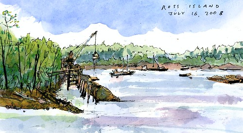
The Willamette River chops right through town, separating the East side from the West side. A bit south of downtown is the still-active Ross Island Sand and Gravel Company. Here's a view of their works, as viewed from the Springwater Corridor Trail as it emerges from Oaks Bottom Wildlife Refuge.

Ross Island (cropped)

That such a mix of the natural and industrial exists mid-city nearby to residential and commercial neighborhoods is, well, very Portland!

The Columbia river forms the northern border of the city and also acts as the state-line between Oregon and Washington. It's a bigger river but adjoins much less populated parts of town than the Willamette. The two rivers converge a bit north of the city (but an easy bicycle ride away) around Sauvie Island. I sketched this beach scene there:

Sauvie Island 2

I suspect that most river pictures of Portland feature a bridge or two (or five). The bridges are quite indeed sketchable. But I'll save my bridge sketches for another post.

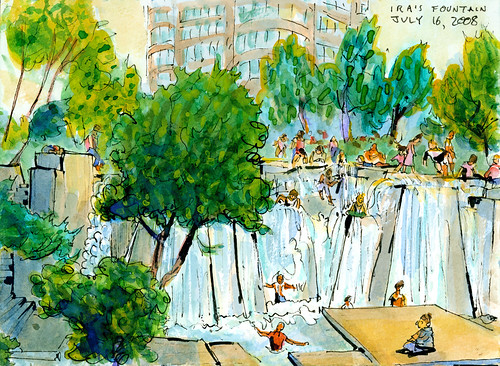
Portland is also home to some tremendously cool public fountains, fountains that the public are very much encouraged to get wet in! On a hot summer's day, can you imagine anything better in the middle of downtown than Ira's Fountain?

Ira's Fountain

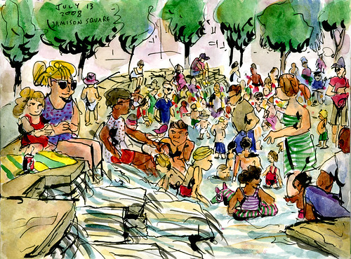
I can't even imagine Ira's Fountain--with its cliffs, falls, and pools--being legal anywhere else in the US. If you want a mellower fountain, perhaps you'd prefer Jamison Square, which has its very own artificial tides.

Jamison Square

(The Salmon Street Springs fountain is also lots of fun. I don't have a sketch of it, but check out the one Gabi did.)