Thursday, November 18, 2010
Spreading the Good Word About Sketching
Click here for an article in a Memphis newspaper about the new Urban Sketchers Memphis.
Saturday, November 6, 2010
Three months have past
The crisp autumn air these days reminds me of the fresh chilly morning in Portland, USA.
These are some sketches from the rest of sessions that I attended.
Urban Nature
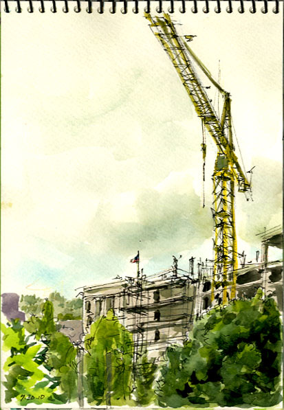
In the session by Jason, we went to the union station and sketched some nature thing in the urban environment.
This is a construction site viewed from the footbridge. In the morning, the sky was covered with thick clouds but all were cleared in an hour from mountain side.
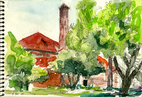
These are garden trees near the station.
Urban Composition
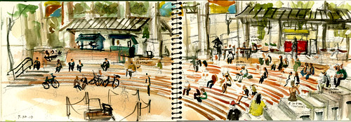
In the session by Gabi, we went to Pioneer Square and we sketched about what was going on at the site. This is a reportage: Urban Sketchers were everywhere in the square. In the foreground, middle ground and background there they were!
Urban People
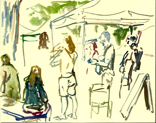

In the session by Isabel, we went to Farmers Market and kept drawing people there. We even drew people in the streetcar on our way to get there.
People come and go, stay and move. What ever the situation was, I just focused on capturing their posture as much as I could. As to some figure, I just managed to draw head and some are upper half of their bodies. I didn't intend to finish or complete the figure. These are done on the large-size Japanese notebook includes an Urban Sketchers logo embossed on the cover: one of the generous souvenir from the symposium.
Urban Architecture

In the session by TIA, many of us drew the building of PNCA. TIA's instruction was concise. These lines go like this and the other side of lines go like this. ( She said something like that with gesture. Sorry, I don't remember exact phrase)
And here is the result.
Here again I would love to thank to all the people who made this happened. To your effort, friendship and blog on USK.
These are some sketches from the rest of sessions that I attended.
Urban Nature

In the session by Jason, we went to the union station and sketched some nature thing in the urban environment.
This is a construction site viewed from the footbridge. In the morning, the sky was covered with thick clouds but all were cleared in an hour from mountain side.

These are garden trees near the station.
Urban Composition

In the session by Gabi, we went to Pioneer Square and we sketched about what was going on at the site. This is a reportage: Urban Sketchers were everywhere in the square. In the foreground, middle ground and background there they were!
Urban People


In the session by Isabel, we went to Farmers Market and kept drawing people there. We even drew people in the streetcar on our way to get there.
People come and go, stay and move. What ever the situation was, I just focused on capturing their posture as much as I could. As to some figure, I just managed to draw head and some are upper half of their bodies. I didn't intend to finish or complete the figure. These are done on the large-size Japanese notebook includes an Urban Sketchers logo embossed on the cover: one of the generous souvenir from the symposium.
Urban Architecture

In the session by TIA, many of us drew the building of PNCA. TIA's instruction was concise. These lines go like this and the other side of lines go like this. ( She said something like that with gesture. Sorry, I don't remember exact phrase)
And here is the result.
Here again I would love to thank to all the people who made this happened. To your effort, friendship and blog on USK.
Labels:
Kumi Matsukawa
Tuesday, October 5, 2010
From Symposium to Group Show
 |
| © Sue Van Etten |
 |
| © Lisbeth Cort |
Ranging from novice to professional artist, symposium participants Faye Castle, Lisbeth Cort and Sue Van Etten are 3 of 14 island artists whose sketches appear in the group show. We're not "urban" but we sure loved capturing the character - and characters - of this place for the show. It's what Urban Sketchers is all about and was highlighted so well in a recent newspaper article entitled, "Whidbey Island Art Group Embraces Camaraderie Through Craft".
We thank symposium instructors and fellow symposium participants for your advice, constructive (and gentle) criticism, and encouragement. We invite you to visit the show if your travels take you to a big island in the middle of Puget Sound just north of Seattle, WA USA this month!
 |
| © Faye Castle |
And thanks for our great memories of the 1st International Urban Sketching Symposium! Hope to see you next year.
Labels:
Faye Castle,
Lisbeth Cort,
Sue Van Etten
Sunday, September 12, 2010
Symposium Aftermath
The symposium was the apex of a very busy summer. It's taken until now to scan sketches done during and since the sketchers feast. And I'm definitely still digesting. It was a wonderfully enriching event and I thank all the instructors, correspondents and participants.
We went to the food carts for our urban colors session.
We went to the food carts for our urban colors session.
Monday, September 6, 2010
Portlanders still sketching regularly after the symposium!
The Portland Urban Sketchers have been meeting regularly and in larger numbers after the momentum of the Symposium. Here is my sketch from our meet up at the White Eagle Hotel and Cafe (eastside of the river)

Please visit the Portland Urban Sketchers to see what we're up to!
Saturday, September 4, 2010
Memphis Urban Sketchers
I was so inspired by the experience of sketching with a group while at the Urban Sketchers Symposium in Portland that I came home and started a group in Memphis. Today was our first group sketch at the Memphis Farmers Market.


Here's my sketch. I didn't get a lot of sketching done because I was busy socializing.

This is Sujata's sketch and gear. She just moved to Memphis from India four months ago, so this group will give her a great way to get to know the city.

This is Chandler's sketch. She teaches art at University of Memphis and makes little postcard-sized watercolors that she sells on Etsy.

Such a treat for me - my nephews and nieces came, too, and made some great sketches. This is my oldest niece, Somerset.

I am so excited about having a group here and being able to share the experience of urban sketching with my fellow Memphians. Thanks so much to all of you for inspiring me!


Here's my sketch. I didn't get a lot of sketching done because I was busy socializing.

This is Sujata's sketch and gear. She just moved to Memphis from India four months ago, so this group will give her a great way to get to know the city.

This is Chandler's sketch. She teaches art at University of Memphis and makes little postcard-sized watercolors that she sells on Etsy.

Such a treat for me - my nephews and nieces came, too, and made some great sketches. This is my oldest niece, Somerset.

I am so excited about having a group here and being able to share the experience of urban sketching with my fellow Memphians. Thanks so much to all of you for inspiring me!
Thursday, September 2, 2010
will's barber shop
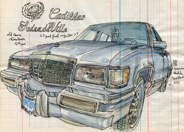
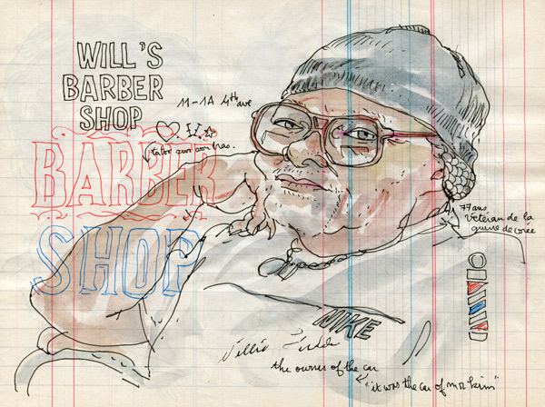
I arrived in portland the day before the symposium, and once out of the train, we went to china town with tia, her husband albert, liz and borromini. I wanted to warm up with an american classic car, and founded this cool cadillac. after a while sketching on the floor front of it, an old guy came out of the near barber shop. he was the proud owner of it. I asked to sketch him, and we talked a few.
will is 77 years old, a veteran of korean war and get a barber shop on 4th ave 11-1a.
visit him if your around there!
 blogged by lapin
Labels:
Lapin,
Portland,
Usk symposium 2010 Portland
Tuesday, August 31, 2010
Portland sketches

I finally managed to post some of my sketches from Portland! It was such an amazing experience to spend time with other sketchers, meet some of the fellow correspondents in real life, and explore the city. This was also an opportunity to try new materials thanks to our sponsors - I tried my hand at accordion-fold Moleskine: to be honest, I favor the watercolor papers a lot more, and I was struggling with this paper until I discovered that Faber-Castell Pitt pen glides well on its smooth surface. I did a line drawing of panoramic views I've seen from the riverfront, and did small portraits of fellow sketchers at dinner in the space underneath it: I was able to capture glimpses of Gerard, Ronnie, Kumi, Tia, Jason, Gabi, Frank, Matt, Lapin, and Isabel. More of my sketches are collected in my blog here.
Saturday, August 28, 2010
My results from Urban Line session
Urban Line

In this session by Frank Ching, we went to the riverside and I drew Steel Bridge. It was a really unique bridge. The middle of lower part of the bridge is movable: A vertical-lift bridge. I saw it went up and a ship went through the beneath and then it went down. After returning it's original position, then a train ran across it. (You can see the train runs in my sketch. )
Mr. Ching's advice to me was to follow the way how the structure was built.(I don't remember the exact phrase but I understand something like that) And to draw the structure, you should draw not only the thing you can see ( superficial details) but also draw hidden part behind. I'm still not so happy with my result since I couldn't capture the lower deck of the bridge. There are some missing pillars backside but thanks to Mr. Ching, I like the upper part.

Then I drew the buildings seen across the river. This glassy building was a tough one. I couldn't figure out what it was exactly like. After drawing these sketches I realized that how great those fellow architects' understanding of structure is and how skillful seemingly easily drawn lines are! I added colors even though it was a Urban Line session. I couldn't resist my desire to make up my deficiency.

In this session by Frank Ching, we went to the riverside and I drew Steel Bridge. It was a really unique bridge. The middle of lower part of the bridge is movable: A vertical-lift bridge. I saw it went up and a ship went through the beneath and then it went down. After returning it's original position, then a train ran across it. (You can see the train runs in my sketch. )
Mr. Ching's advice to me was to follow the way how the structure was built.(I don't remember the exact phrase but I understand something like that) And to draw the structure, you should draw not only the thing you can see ( superficial details) but also draw hidden part behind. I'm still not so happy with my result since I couldn't capture the lower deck of the bridge. There are some missing pillars backside but thanks to Mr. Ching, I like the upper part.

Then I drew the buildings seen across the river. This glassy building was a tough one. I couldn't figure out what it was exactly like. After drawing these sketches I realized that how great those fellow architects' understanding of structure is and how skillful seemingly easily drawn lines are! I added colors even though it was a Urban Line session. I couldn't resist my desire to make up my deficiency.
Labels:
Frank Ching,
Kumi Matsukawa
Friday, August 27, 2010
Urban Color Games
I was assigned to lead two sessions of "Urban Color" for the Symposium. No problem, I love color! But I was keen to come up with something more challenging and enriching than "let's all go out and sketch with some colors." Luckily, the folks in my sessions were up for playing along with my games.
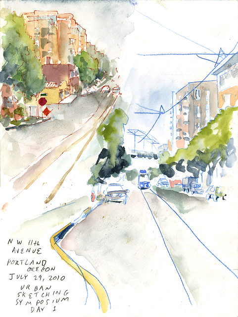
The first exercise we did was to draw with a non-black line. When you use a colored line, a few magical things happen, including: the line is no longer necessarily the darkest part of the sketch; objects that are the same color as the line take on a special power (as in the blue streetcar below); the mood and light of the scene shifts to be warmer or cooler, etc. Here's two views looking in opposite directions on 11th Avenue, one with a sanguine line, one with a blue line:
And here's a pink line. (I borrowed what I thought was a colored pencil for this one. Turned out to be a watercolor pencil, so my line dissolved as I colored. I did my best to work with it.):

Next, we tried drawing the same scene twice, but coloring the two sketches differently. The first sketch was colored in a literal or realistic fashion, really trying to match the existing colors as seen. The second one was colored with an impressionistic or fantasy scheme. It was great to see people having fun with this exercise. In many cases, the sketch with the "wrong" colors was more successful. I suspect this is because you can convey more of the light and feel of a scene when you are not tied into trying to communicate color information.
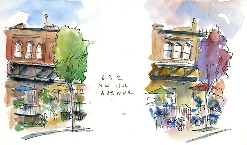
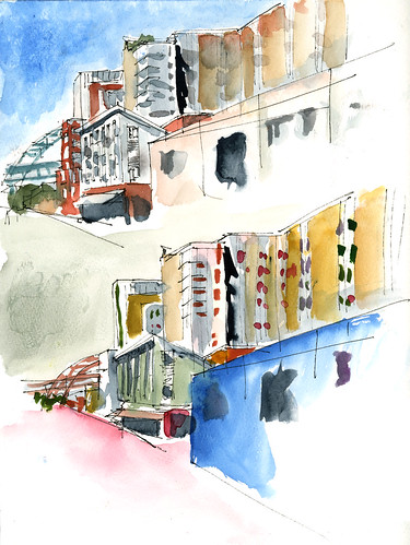
The final exercise was the really awesome one. Find a friend and try this yourself! We each did a line drawing, then handed it off to another sketcher, who did the colors. It was wonderful to see how someone else would color your drawing, and also wonderful to color a drawing you didn't have to do yourself. I was lucky enough to get paired with Kumi Matsukawa. Coloring in her sketch, I forgot it wasn't my own (except for a scary moment when I realized I'd painted a sculpture as if it was a tree--saved by some panicked blotting and scrubbing). And looking at Kumi's colors on my sketch, I find it hard to believe it's really my drawing.
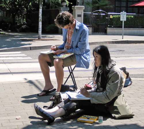
Here we are, hard at work (Photo by Don McNulty:
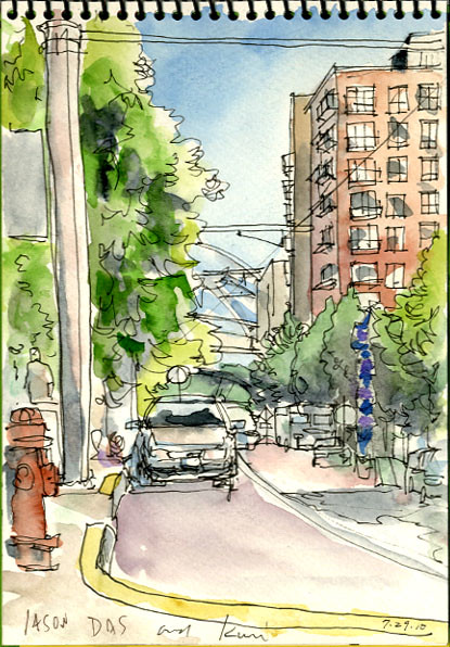
Here's Kumi's sketch, as colored by me:
And here's my sketch as colored by Kumi (and so much better than if I'd colored it myself!):

Cool stuff, right?
These exercises are all worth repeating and also work outside of the Urban Sketching context. I encourage you to try them out. Whether or not you love all the results as stand-alone pieces, it'll be fun and provide some new perspectives and insights.
Kumi and Pete Scully both did posts about their experiences in my color workshop--go check those out. (I suspect some other folks also blogged about this; drop a link in the comments and I'll add you!)
The first exercise we did was to draw with a non-black line. When you use a colored line, a few magical things happen, including: the line is no longer necessarily the darkest part of the sketch; objects that are the same color as the line take on a special power (as in the blue streetcar below); the mood and light of the scene shifts to be warmer or cooler, etc. Here's two views looking in opposite directions on 11th Avenue, one with a sanguine line, one with a blue line:

And here's a pink line. (I borrowed what I thought was a colored pencil for this one. Turned out to be a watercolor pencil, so my line dissolved as I colored. I did my best to work with it.):

Next, we tried drawing the same scene twice, but coloring the two sketches differently. The first sketch was colored in a literal or realistic fashion, really trying to match the existing colors as seen. The second one was colored with an impressionistic or fantasy scheme. It was great to see people having fun with this exercise. In many cases, the sketch with the "wrong" colors was more successful. I suspect this is because you can convey more of the light and feel of a scene when you are not tied into trying to communicate color information.


The final exercise was the really awesome one. Find a friend and try this yourself! We each did a line drawing, then handed it off to another sketcher, who did the colors. It was wonderful to see how someone else would color your drawing, and also wonderful to color a drawing you didn't have to do yourself. I was lucky enough to get paired with Kumi Matsukawa. Coloring in her sketch, I forgot it wasn't my own (except for a scary moment when I realized I'd painted a sculpture as if it was a tree--saved by some panicked blotting and scrubbing). And looking at Kumi's colors on my sketch, I find it hard to believe it's really my drawing.
Here we are, hard at work (Photo by Don McNulty:

Here's Kumi's sketch, as colored by me:

And here's my sketch as colored by Kumi (and so much better than if I'd colored it myself!):

Cool stuff, right?
These exercises are all worth repeating and also work outside of the Urban Sketching context. I encourage you to try them out. Whether or not you love all the results as stand-alone pieces, it'll be fun and provide some new perspectives and insights.
Kumi and Pete Scully both did posts about their experiences in my color workshop--go check those out. (I suspect some other folks also blogged about this; drop a link in the comments and I'll add you!)
Labels:
color,
Jason Das,
Kumi Matsukawa
Thursday, August 26, 2010
Addendum: Tanner Springs and more
Almost a month after the Symposium....and I am still harboring images and thoughts about all the people and sketches that filled those three memorable days. Thank you all for posting your comments and sketches....both before and after! They are truly inspirational. I could say 'ditto' to most everything that has been said. The instructors and participants, in my mind, are all first rate!
The wonderful sketches of Tanner Springs prompted me to add my interpretation. I have always loved this unusual park that is sometimes misunderstood by the public.( I'm a landscape designer, and live just outside of Portland) In quiet, contemplative contrast to Jamison Park just a few blocks away, Tanner Springs holds Nature quietly in the palm of it's hand. When Simo brought our group there for our final sketching, I was honestly worn out from three fantastic days of a non-stop symposium.... but determined to loosen up a bit and see things from a different perspective. Now I can't wait to go back this Winter...for an entirely different experience!
You can see more of Portland and what keeps me loving it, on my website and linked blog.... http://www.gardenaesthetics.com/
Linda Engstrom
I generally work in pen and ink but have had a period in my earlier years of working in watercolor. Somehow life got in the way, and I recently have only found time to sketch or dable in artistic endeavors when we were off on vacation. No more! I have always known that drawing enables you to really see the world and all of those great details that the average person misses. Drawing is such a gift, and makes your life so much richer. Thank you all for bringing it back to me as an everyday habit....the moleskin now joins my camera as a constant companion. I look forward to coming to Lisbon next year!
You can see more of Portland and what keeps me loving it, on my website and linked blog.... http://www.gardenaesthetics.com/
Linda Engstrom
Wednesday, August 25, 2010
Struggling with Tanner Springs and The Fields
I think everyone at the Symposium was involved in at least one field sketching session that went to Tanner Springs Park. And why not? It's near the school, and it offers a real slice of (simulated) wild nature in a city block. It's a great park. But I don't think I'm the only one who found it frustrating to sketch. Something about the park's low vegetation, even lower water features, complex skeletal constructions, and the boring modern condos that surround it made it tough to find a satisfying vantage point and balance of detail and background. This frustration may have to do with why so many of us wandered up to the vast empty field to the north, the future site of The Fields Neighborhood Park Project. This less-planned space presented open vistas, a great view of the Fremont bridge, several abandoned factories, the Pearl District's iconic water tower, a giant yellow sculpture called "Rational Exuberance", dogs running exuberantly free, and (if you really missed them) more boring modern condos.
Here's the main sketch I did of Tanner Springs with one of my Urban Nature sessions. I guess it's fine, but I don't love it. And I really hate the paper I did it on (The blue Canson XL "Mix Media", one of our freebies; I like the other Canson papers we got quite a lot, but this one just does not jibe with my watercolor technique).
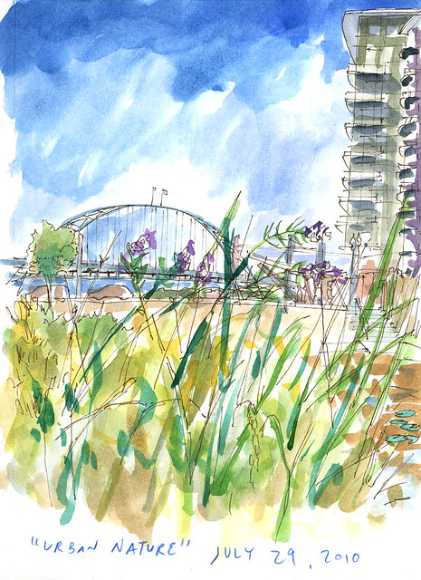
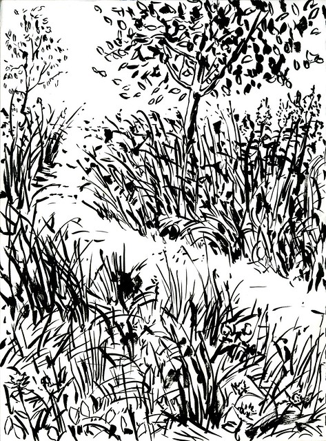
Halfway through the session, my group and I all discussed how danged challenging it was to sketch the meadow of the park. So that made it clear what our next exercise should be--sketch the meadow! Dive right into the hardest part and make it work! Here's my meadow sketch, done with a very nice Kuretake brush pen lent to me by Don Colley:
Then we cut out of there for the yellower pastures of the Fields. Here's the first sketch I did up there:
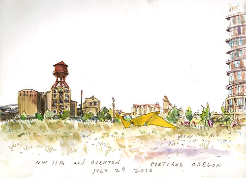
I wasn't too happy with it--the broad perspective and my desire to get everything in there led to an unbalanced result. Later on, I realized I like this sketch just fine if I crop it to a narrow strip:

Much better!
After disappointing myself with the sketch above, I did the thumbnail below to help someone else with their own composition. It was sobering to realize that this thumbnail was better (if much less complex) than the sketch I'd just poured far more time into.
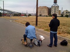
It wasn't til I came back two days later that I got my favorite sketch of the Fields. The water tower is what drew me there originally, but it didn't make the sketch, nor did the sculpture. What turned out to be more important was an interesting angle on the bridge and buildings, plus including the people and dogs:

And here's a photo of me doing that sketch, alongside Matt Brehm. (photo by Liz Steele):
Here's the main sketch I did of Tanner Springs with one of my Urban Nature sessions. I guess it's fine, but I don't love it. And I really hate the paper I did it on (The blue Canson XL "Mix Media", one of our freebies; I like the other Canson papers we got quite a lot, but this one just does not jibe with my watercolor technique).

Halfway through the session, my group and I all discussed how danged challenging it was to sketch the meadow of the park. So that made it clear what our next exercise should be--sketch the meadow! Dive right into the hardest part and make it work! Here's my meadow sketch, done with a very nice Kuretake brush pen lent to me by Don Colley:

Then we cut out of there for the yellower pastures of the Fields. Here's the first sketch I did up there:

I wasn't too happy with it--the broad perspective and my desire to get everything in there led to an unbalanced result. Later on, I realized I like this sketch just fine if I crop it to a narrow strip:

Much better!
After disappointing myself with the sketch above, I did the thumbnail below to help someone else with their own composition. It was sobering to realize that this thumbnail was better (if much less complex) than the sketch I'd just poured far more time into.

It wasn't til I came back two days later that I got my favorite sketch of the Fields. The water tower is what drew me there originally, but it didn't make the sketch, nor did the sculpture. What turned out to be more important was an interesting angle on the bridge and buildings, plus including the people and dogs:

And here's a photo of me doing that sketch, alongside Matt Brehm. (photo by Liz Steele):

Labels:
Jason Das
Sunday, August 22, 2010
Me, too, I've finally composed a blog post of my Symposium Experience
You'll find my 2-part post on either my Painted Cats Blog or the Urban Sketchers Portland blog. This event was such a wonderful experience. I am STILL having dreams featuring random Urban Sketchers talking about sketching or actually sketching. I am also daydreaming about Portugal and how to make that happen, because I just CAN'T miss it!
Instead of re-writing my posts that I have on the blogs mentioned above, i will make a list of some favorite Symposium moments or quotes:
Instead of re-writing my posts that I have on the blogs mentioned above, i will make a list of some favorite Symposium moments or quotes:
- "Woodstock of Sketching", Matthew Brehm
- "I channeled my inner Andy Warhol", Linda Daily, during Jason Das' urban color session where we mixed it up!
- Urban Sketchers taking over the street car (and seeing so many sketchers sketching on it!)
- Day one, first lecture, looking next to me and seeing Suzanne sketching her food and realizing nearly everyone around me was sketching....My PEOPLE!
- Introducing myself to Pete Scully, Gabi Campanario and Suzanne Cabrera, all people I followed online for a few years!
- Meeting Lapin, who for some reason feels a bit like a rock star in the sketching world
- Getting the goody bag full of supplies and just imagining all the sketches that would go in it to record the experience!
- Dinner with fellow sketchers, all sketching
- Meeting lots of local folks who are now starting to come to our sketchcrawls!
- Seeing all of the Portland Urban Sketchers have big smiles on their face throughout the event!
- The Sketchbook Exhibit--what a wonderful way to wrap up the 3 day event.
Labels:
Alanna Randall
Friday, August 20, 2010
Jason Das Finally Gets Around to Scanning Some of His Symposium Sketches
The Symposium was pure magic. Huge thanks to all involved. I'm planning to have a couple of more focused posts after this one, but here's everything that didn't fit into those.
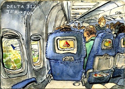
I did a sketch on the plane on the way in. I was pretty sure everyone else would have a plane (or train) sketch and I didn't want to feel left out. I also figured it'd be smart to warm up a bit.
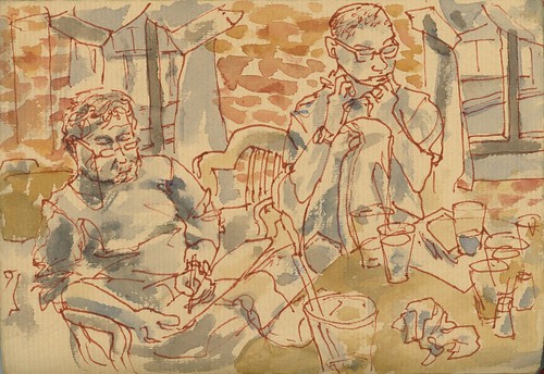
Yes, plunged into sketching pretty much as soon as we hit town. Here's Gérard Michel and Pete Scully as we found them upon arrival, sketching away!
A lot of the sketching I got down during the Symposium was snatched in odd, quick moments. I was so busy, I didn't find time for "proper" sketches. Here's three scattered quick views sharing a page.
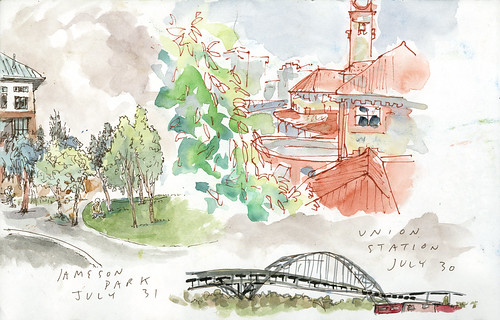
(If you look closely, you'll spot Gérard on his little stool sketching this view of Jamison Park.)
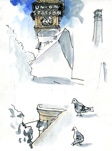
Here's some more, even quicker ones of Union Station. Three minutes is plenty sometimes!
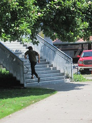
Sue van Etten caught me running up the Union Station footbridge (all of my Union Station sketches are from up there)...moving fast so I can squeeze in a little time for sketching if I'm lucky.
My sketch for Gabi is from that staircase, too:

Below, another view from the Union Station footbridge, and below that, fellow instructors Frank Ching, Isabel Fiadeiro, and Gabi Campanario relaxing after another crazy day.

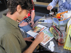
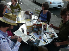
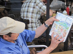
Here's photos of that one happening, courtesy Pete and Gabi:

I led groups for the first three field sessions, so by the time Friday afternoon rolled around I was so relieved to not be on-duty that I splashed out to the middle of Ira's Fountain (perhaps my favorite place in all of Portland).

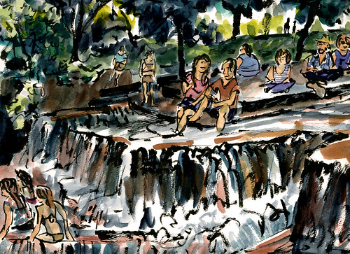
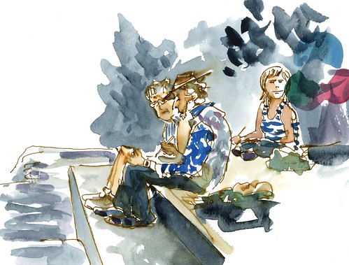
Can you spot Suzanne Cabrera, Lapin, and Liz Steele in there? Here's a closer view of Lapin and Suzanne:
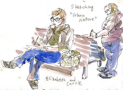
And for more sketching the sketchers, here's Elizabeth and Carrie in Jamison Park on Saturday morning:
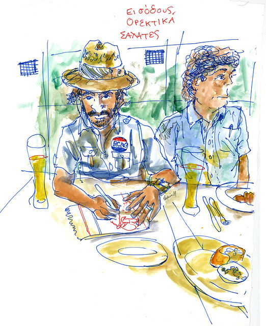
And finally (for this post), here's Lapin and Matt at dinner the final night. Lapin and I were sketching each other simultaneously. The original of this is rather huge, as I drew it right on the table cloth. (Here's his sketch of me.)
I did a sketch on the plane on the way in. I was pretty sure everyone else would have a plane (or train) sketch and I didn't want to feel left out. I also figured it'd be smart to warm up a bit.

Yes, plunged into sketching pretty much as soon as we hit town. Here's Gérard Michel and Pete Scully as we found them upon arrival, sketching away!

A lot of the sketching I got down during the Symposium was snatched in odd, quick moments. I was so busy, I didn't find time for "proper" sketches. Here's three scattered quick views sharing a page.

(If you look closely, you'll spot Gérard on his little stool sketching this view of Jamison Park.)
Here's some more, even quicker ones of Union Station. Three minutes is plenty sometimes!

Sue van Etten caught me running up the Union Station footbridge (all of my Union Station sketches are from up there)...moving fast so I can squeeze in a little time for sketching if I'm lucky.

My sketch for Gabi is from that staircase, too:

Below, another view from the Union Station footbridge, and below that, fellow instructors Frank Ching, Isabel Fiadeiro, and Gabi Campanario relaxing after another crazy day.

Here's photos of that one happening, courtesy Pete and Gabi:


I led groups for the first three field sessions, so by the time Friday afternoon rolled around I was so relieved to not be on-duty that I splashed out to the middle of Ira's Fountain (perhaps my favorite place in all of Portland).


Can you spot Suzanne Cabrera, Lapin, and Liz Steele in there? Here's a closer view of Lapin and Suzanne:

And for more sketching the sketchers, here's Elizabeth and Carrie in Jamison Park on Saturday morning:

And finally (for this post), here's Lapin and Matt at dinner the final night. Lapin and I were sketching each other simultaneously. The original of this is rather huge, as I drew it right on the table cloth. (Here's his sketch of me.)

Labels:
Jason Das
Subscribe to:
Comments (Atom)


